Apple is well-know with its simplicity, easy to use, and beautiful design, both the hardware or software. They design every detail to get these 3 things, but sometime they more concern to the simplicity and beauty over “easy to use”. It’s happened several times to their hardware design, including the 2 latest Apple accessories: Apple Pencil and Magic Mouse 2. Both look beautiful and simple, and I think, everyone will not doubt the designs of Jony Ive, but they forgot about the “easy to use” side, foremost in terms of charging the device. That’s it! For the rest of it, we can give them the thumb up, but when it comes to charge these 2 devices, you can feel how ridiculous it is. Here are the 2 bad Apple accessory designs in 2015.
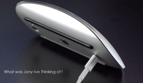
Let’s take a look at the Magic Mouse 2. At this moment, Magic Mouse 2 has the non removable internal battery and you can charge it by using a lightning cable. Can you guess where is its lightning port? It’s situated in the bottom and it looks weird. Yes indeed, it seems there’s no other part on Magic Mouse suits to place the lightning port, even on its sides, but I think they can place it on the top instead of the bottom, so that we are still able to use it while it’s charging. Apple didn’t do that because it can ruin the beauty and simplicity of it. Whether Apple doesn’t have the other design options and decide to keep the current design even though it’s bad?

Source: patentlyapple.com
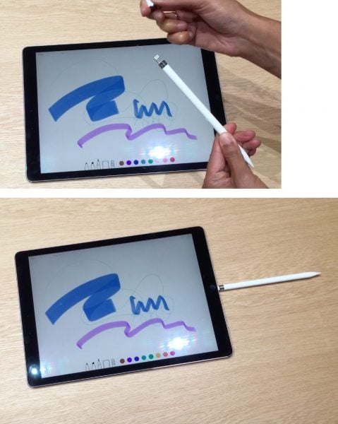
The second bad accessory is the Apple pencil for iPad Pro. We may agree that Apple Pencil has a beautiful design and can compete with any stylus, including the Surface Pen. This Apple Pencil has a non removable battery and you can charge it when it’s empty. But, how to charge it? You will not find anything until you open its cover on the top of it, in which there’s a lightning male connector to connect it to iPad Pro to charge. It looks nice and simple, but again, it’s not easy to use. If you own this Apple Pencil and iPad pro, you will understand what I meant. Let’s see on the picture below. Accidentally, we can break it easily.

Source: digitalartsonline.co.uk
Again, I think these are weird designs from Jony Ive, in the name of beauty. Will Apple fix it? I think, it will need at least 2 years for this product to re-cycle. Just look at MacBook Pro, which has USB ports too close one to another, and it stayed like that for 4 years without improvement until the MacBook Pro Retina display came and separate these USB ports. It can be the moment for Apple in the future, to ask for the users feedback, like they have done in improving the EarPods.
The other news: What’s So Interesting About iFixit Teardown iMac 21 4K, Magic Keyboard, Magic Trackpad 2, and Magic Mouse 2


